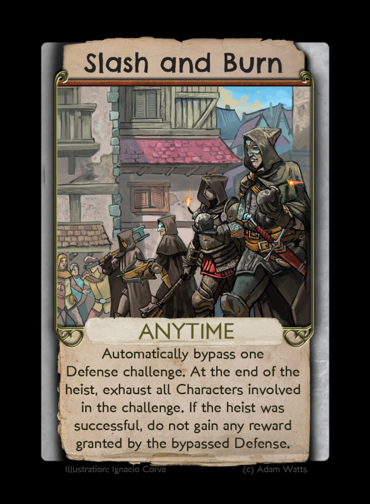
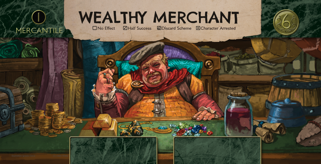
It’s amazing how much of a difference some good art can make.
You may have already noticed the new logo in the banner area of this page (if you’re reading this in the blog excerpt, click on the Read More link). That’s the new logo for the game, painted for me by artist Larisa Angheloni based on the older, simpler logo that I drew up a while back. The old logo will still be used in places where a simpler image is called for, like the backs of cards, but the new one will be showing up everywhere else–box, rulebook cover, every page on the website about the game, etc. It looks fantastic, and I’ve caught myself just sitting and staring at it more than once over the past few days.
In addition to the new logo, art for the cards and Objective mats has started rolling in. This should give people some sense of what I want the game to look like post-Kickstarter, when I have enough money to get all the cards illustrated.


It’s always exciting when the game makes a visual leap like this. First it was my scrawled paper prototype to one printed on colored cardstock, then the major jump from cardstock to manufactured cards bought at a print-on-demand retailer. Now it’s the jump from temporary placeholder art to commissioned, custom artwork done specifically for the game. Every day, slowly but surely, this thing I’ve been working on for almost two years starts to get a little more real. What a great feeling.


Leave a comment